
Showing posts with label pencil. Show all posts
Showing posts with label pencil. Show all posts
Friday, 12 July 2013
Quick drawing.

Sunday, 16 December 2012
Design visualisation: observational drawing and modelling.
I decided to use a glove as the base for my observational drawing, to link with my theme of trace elements. A glove is often something people lose without noticing, if it falls out of a pocket, and it is a trace of the person who has been there.

I started off by using a graphite stick and pencil to do some quick sketches of the glove, in various different sizes and positions. I then used ink and collage to work into my drawing, to highlight interesting patterns and shapes.

I also did some separate quick drawings, to try to capture some of the different tones and shadows in the glove.

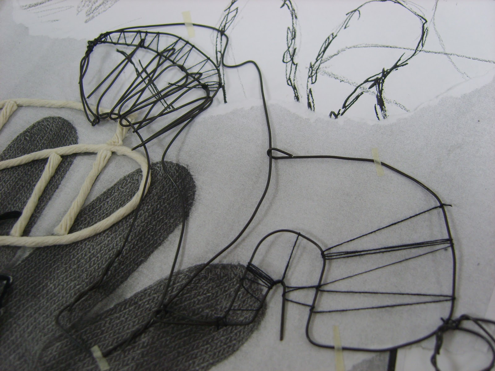
After this, I started picking out some of the interesting patterns and shapes to make in wire. I found it difficult to bend very tight angles in the wire so some parts were more curved than I hoped they would be.

I then started to use black thread with the wire to create different thicknesses of lines, and some sharper angles. Some of the wire bits didn't look at all like a glove, but I found this was a good way to generate ideas from everyday objects, that could be used for jewellery or a printed pattern.



Sunday, 14 October 2012
Illustration: Observational bird drawings


This toucan is drawn using the same method, but with a felt tip pen. I like the shape of his beak and his feet. It looks like a toucan even though his head isn't complete.

Wednesday, 10 October 2012
Life Drawing: Perspective.
In our third week in life drawing, we focused on drawing figures from different perspectives and angles. The hardest part I found was not being able to measure in heads, when the whole of the head wasn't visible. we didnt do much work on tone this week, just proportions, angles and perspective.

 This one was very difficult. I measured it it feet instead of heads, and it was hard because my brain was telling me that a torso should be long, but because of the angle, this torso needed to be very short and angled, so I was trying to draw what I saw, and my brain was trying to draw what it thought a body should look like.


Life drawing: Line and Tone


In the lying down pose I think my hatching works better because of the very dark parts, like the shadow on her tummy and the back of her thigh.

Saturday, 22 September 2012
Fine Art


This one is one of my favourites, because I like the contrast between the very precise, almost photographic nature of the background with the random, messy blue on top. I found that dropping the paint-covered string, rather than laying it down, made better patterns and wiggles. I also like the simple blue and brown colour-scheme, because I think the brown makes the blue look bluer.

I like the contrast between the pink and green on this one, and the simplicity of the design. I added the blue right at the end, because without it, the colours felt too unbalanced because there was no mid tone in between the bright pink and the dark green.

I used rolled up paper and a projector to make the green spirals. I liked the green and brown together, and they looked very natural together, so I decided to add the blue as a contrast and focal point. I used the same method of dropping the string I used earlier, so the random patterns contrasted with the repetition of the background.
Monday, 17 September 2012
Line Drawing

We also tried drawing objects with as few marks as possible (each time the pencil lifted off the paper counted as a mark). I drew a phone using nine marks. I found this very interesting because it made me really think about which lines were important, and what could be left out without affecting the communication of the object to the viewer. I quite enjoyed the challenge of drawing in such a stripped-back and basic style.


Subscribe to:
Posts (Atom)