This weeks life drawing was focused on foreshortening, which is essential to make figures the right proportion when they are lying down or seated. Seated poses viewed from the front often need thighs to be drawn a lot shorter than the brain wants. I found the legs on both my drawings very difficult, because on my first line drawing, the legs were a lot smaller than I thought they were, and on the second drawing, the thighs were a lot shorter than I expected, and the lower legs and feet seemed very long in comparison because I could see along the whole length of them. I found that stepping back and looking at my drawing as a whole made it easier to see any mistakes in the proportions or perspective.
We only did two drawings this week, one line drawing, and one with tone. We spent most of the day on our second drawing, which gave us time to get the proportions right then focus on adding the tone. I am very pleased with this drawing because of the subtle changes in tone the charcoal can achieve. I think this is one of my best drawings yet.
Showing posts with label Life drawing. Show all posts
Tuesday, 13 November 2012
Sunday, 11 November 2012
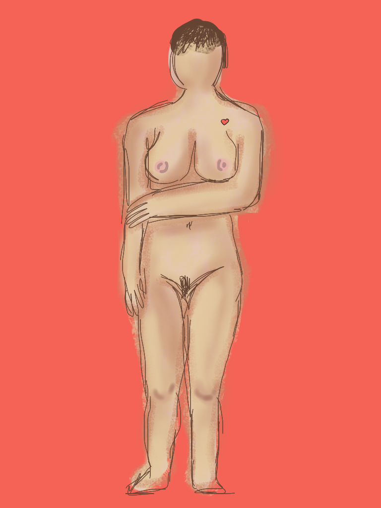
Life drawing: iPad drawing
This weeks life drawing was a bit different, because we were drawing on an iPad. I quite enjoyed it, which I wasn't expecting to, because I don't enjoy drawing digitally. It was surprisingly easy, using the application 'brushes' because I could draw with my finger, and change the width of the lines and the type of lines easily.
I usually had four layers on each drawing, one for the background, one for the outline sketch, one for a mid tone flesh coloured fill, all over the figure, and one for the highlights and lowlights. This meant I could erase parts of each layer without disrupting the other parts. I found this worked well because i could rearrange the layers so the outline was on top, even if I drew it before the other parts. I experimented with the different types of brushes and lines to get different effects, some more blurry and fuzzy and some more sharp and detailed.
I usually had four layers on each drawing, one for the background, one for the outline sketch, one for a mid tone flesh coloured fill, all over the figure, and one for the highlights and lowlights. This meant I could erase parts of each layer without disrupting the other parts. I found this worked well because i could rearrange the layers so the outline was on top, even if I drew it before the other parts. I experimented with the different types of brushes and lines to get different effects, some more blurry and fuzzy and some more sharp and detailed.Thursday, 1 November 2012
Life drawing : Paint.
We used paint this week to add tone to our drawings. We started by only using blue and dark brown, and Varying the amount of water to get more diluted, paler shades. I also left the lightest parts white, and let the paper show through.
We then moved on to a large A1 drawing, using more natural flesh tones. Each time I mixed a new colour, I put it in all the places around the body before moving on to the next colour. I think this makes it look like a coherent whole, and I found it easier than painting it in bits. The aim was not to blend the colours, but to put in blocks of tone to build up the whole picture.
Life drawing : Colour
This weeks life drawing was focused on colour, and using colour that wouldn't be used normally, like blues and greens. I think this sometimes worked well, but It was hard to know how much colour to put on without making it look very unnatural. I feel I have got better at looking at proportions, and I've found that I am not rubbing out lines as much. Yellow ochre and other earth colours made quite convincing flesh tones, but I enjoyed experimenting with other, brighter colours like yellow, orange and bright pinkWe then added ink, using prussian blue to make the shadows and darker areas, then worked into the ink with pastels for the lighter areas. On the ink and pastel drawings, I tried to only use two or three pastel colours, because of the dark tone of the ink, and the mid tone of the paper, I didn't want them to be too busy.
I am pleased with this drawing, because I think I have used the tone of the paper well, and I have used white and yellow for highlights, and brown pastel and blue ink for shadows and darker areas.
Friday, 19 October 2012
Life drawing: Sculpture
This week, instead of drawing, we used clay to make the figure. We started with basic shapes, and then used clay tools and our hands to refine this into a more realistic figure. I enjoyed this, but in the time we had, I found I couldn't get all the smaller details in. I think I captured the proportions quite well, and I enjoyed how easy it was to change parts by adding and taking away little pieces of clay.


Making the head sculpture was my favourite part, because of how much detail I could put in, but I also enjoyed the process of building up the head, starting with a newspaper base, then building up the basic head shape with clay. Each four minutes, we all moved positions, so as to get an all round view of the head. I struggled for a while to get the profile right, but I think my end result turned out well and is very realistic.


Making the head sculpture was my favourite part, because of how much detail I could put in, but I also enjoyed the process of building up the head, starting with a newspaper base, then building up the basic head shape with clay. Each four minutes, we all moved positions, so as to get an all round view of the head. I struggled for a while to get the profile right, but I think my end result turned out well and is very realistic.
Sunday, 14 October 2012
Life drawing: Tone.
This week, we were using tone, with no lines. I found this very hard because it was difficult to put the blocks of tone in the right place and still get the proportions right. I also found it took more time to build the image, whereas with line it is easy to get the basic shapes in fairly quickly. I also found that the background plays a big part in the range of tones, as a dark background makes the figure look lighter and vice versa.At the start, we were just using charcoal on white cartridge paper, but I found it difficult to get the full range of tones, because a lot of shading was needed to make it dark enough that only the lightest highlights were still white.
Next, we shaded in the whole of the paper grey with charcoal, so that was a mid tone, and more charcoal could be added to make it darker, and it could also be taken away with a putty rubber to make it lighter. I found this a lot easier, because the background meant I had a shade to compare the figure to. If a part was lighter the background, I used the putty rubber, but if something was darker than the background I added more charcoal. This meant I didn't have to shade parts of the background in to make the figure look lighter. The only bit I didn't like was the way that the charcoal background picked up the texture of the drawing board underneath, so it wasn't a flat colour.
After this, we used creamy beige coloured sugar paper, with white chalk and charcoal, so the background was quite light. I had to shade in the background to make it contrast with the figure.
My favourite way of drawing with tone was with the three different colours, black (charcoal) white, and red (chalk) and we were still working on the sugar paper. When the red and white mixed, it made pink, and when the red and black mixed it made a brown.
I think working with tone has made me look closer at the different shapes and blocks of tone, instead of assuming, to capture the contours of the body realistically.
Labels:
black and white,
chalk,
charcoal,
Life drawing,
pastels,
tone
Wednesday, 10 October 2012
Life Drawing: Perspective.
In our third week in life drawing, we focused on drawing figures from different perspectives and angles. The hardest part I found was not being able to measure in heads, when the whole of the head wasn't visible. we didnt do much work on tone this week, just proportions, angles and perspective.
This one was very difficult. I measured it it feet instead of heads, and it was hard because my brain was telling me that a torso should be long, but because of the angle, this torso needed to be very short and angled, so I was trying to draw what I saw, and my brain was trying to draw what it thought a body should look like.
Life drawing: Line and Tone
We only used hatching, not cross hatching, so that the lines all go in the same direction and eye won't see it as lots of small lines, but rather areas of dark and light. I am very pleased with the collarbone and shoulder area of this drawing because I think it shows the contours well, but I think I could improve by using even darker tones, to make it look less flat.
In the lying down pose I think my hatching works better because of the very dark parts, like the shadow on her tummy and the back of her thigh.
Life drawing : Line.
In our first week of life drawing, we were just looking at line, to get the proportions right. We used pencils to measure how many 'heads' tall the model was, and to check angles. We were using charcoal, which I found quite difficult because it created a thick line, and often smudged when I didn't want it to. I struggled to get the widths right in the first standing pose, but I think the sitting pose was better, because I measured the widths at the start, so I think I captured the proportions better.
Subscribe to:
Posts (Atom)