 Jonathan Calugi
I like the intricacy of Calugi's works, each one made up of lots of smaller images and shapes. He also uses very few colours, so even the very complicated and detailed images aren't too busy.

Janine Rewell
I like this work because of the shapes she has used, but also the way she has used the human body. this was made by putting vinyl stickers onto the model's skin, and then using a tanning booth to tan the parts of the model that weren't covered up.

Jean Jullien
Jullien's graphic design is very illustrative, and often includes hand rendered typography. I like the bright colours she uses, and the black outlines are very bold.
Fabien Barral
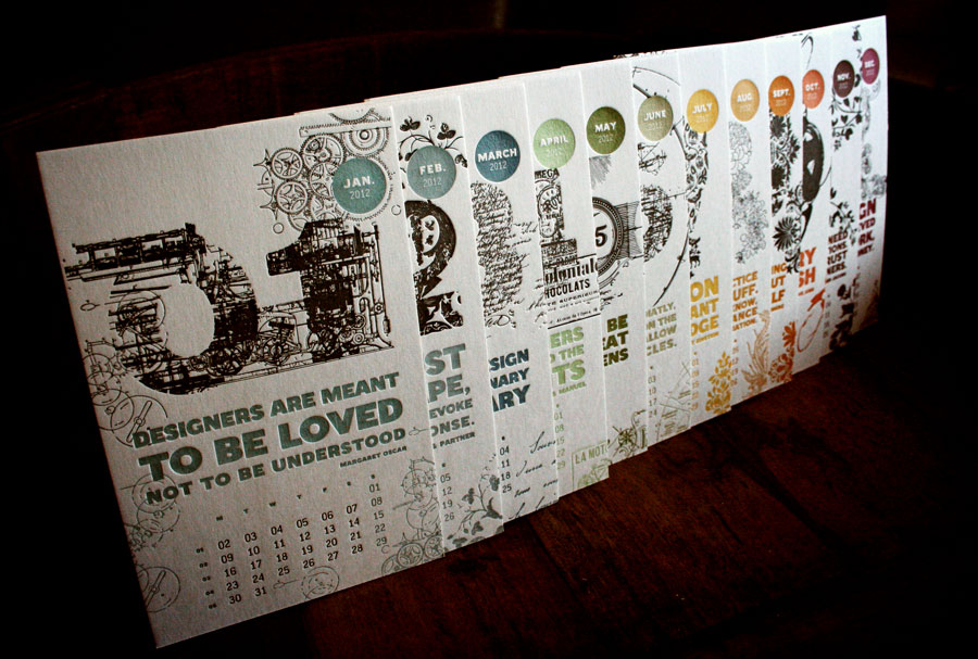
I like Barral's typography, because he uses images inside the letters, and keeps to one or two colours so his designs aren't overly complicated but are very effective.
 David Airey
I think what strikes me most about this piece of brand identity design is Airey's use of colour. He has used all different shades of blue in the background, and this theme is carried on into the photo. I really like the simple shapes and geometry of this, and i think it is very effective as all the viewers attention is directed at the photo and the brand name.
David Carson
David Carson is a graphic designer and typographer, and some of my favourite works are ones where he has overlaid type onto a photo, because he does it in such a way that makes them work together, with neither one overpowering the other.
No comments:
Post a Comment