
Friday, 26 October 2012
Katy Aston: Textile design.
Sunday, 21 October 2012
Thorsten Brinkmann inspired photographs

We made similar photographs by dressing and covering each other with cloth and hats, and also used objects. The pose of the figure was very important because it was the only way of showing emotion and feelings, because you couldn't see their facial expression. When I was modelling it felt very strange because I was trapped in the cloth, but at the same time it felt quite safe, because nobody else knew what you were thinking so it was easier to become a different character.
The third picture along was the one that I dressed, I decided to use black and white because it was very striking, and I liked the idea of the stripes going across the body.

I am dressed in a purple robe, bottom left, and I think because I am kneeling, the fabric drapes nicely and falls well on the floor.
Black and white photography.
 Inspired by Corinne Day's 'The Face' we approached portrait photography in a slightly different way, so that the subject was not posing, but answering questions while being photographed. This was to try to make the model to forget they were being photographed, to get more natural, expressive faces. We were using 35mm film cameras, and we used the darkroom to develop the photos ourselves. I enjoyed learning the process of how the film negatives are made into prints.
I printed nine different photographs of Alex, and arranged them in a similar way to 'The Face' but I think the black background with white in between makes them look more separate, and not so much a whole artwork. I like the contrast in these photos, especially her stripy top, and her face stands out really well from the black background.

I then took the background off by cropping them on the computer, and I think this closeness makes it look more like an artwork, rather than a series of photos.
I really enjoyed working in the photography studio and darkroom, and doing the whole process from start to finish, taking the photos and developing them into an end product.

long exposure photography
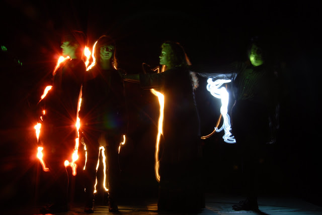
These photos used a similar method to the light painting, using a long exposure, but instead of torches, we used a series of flashes to capture the pictures. To get the movement, we all swapped places and moved around, so each time the flash went off, The camera captured everybody in a different position.


Friday, 19 October 2012
Light painting
Light painting is a method that uses long exposure photography and torches to create an image.

 We used torches to draw around people, then scribble around them , to create silhouettes. I enjoyed this, but it was difficult to get the whole silhouette, because if the torch was not pointing at the camera, it did not record the light, so doing the lower parts we had to crouch down.


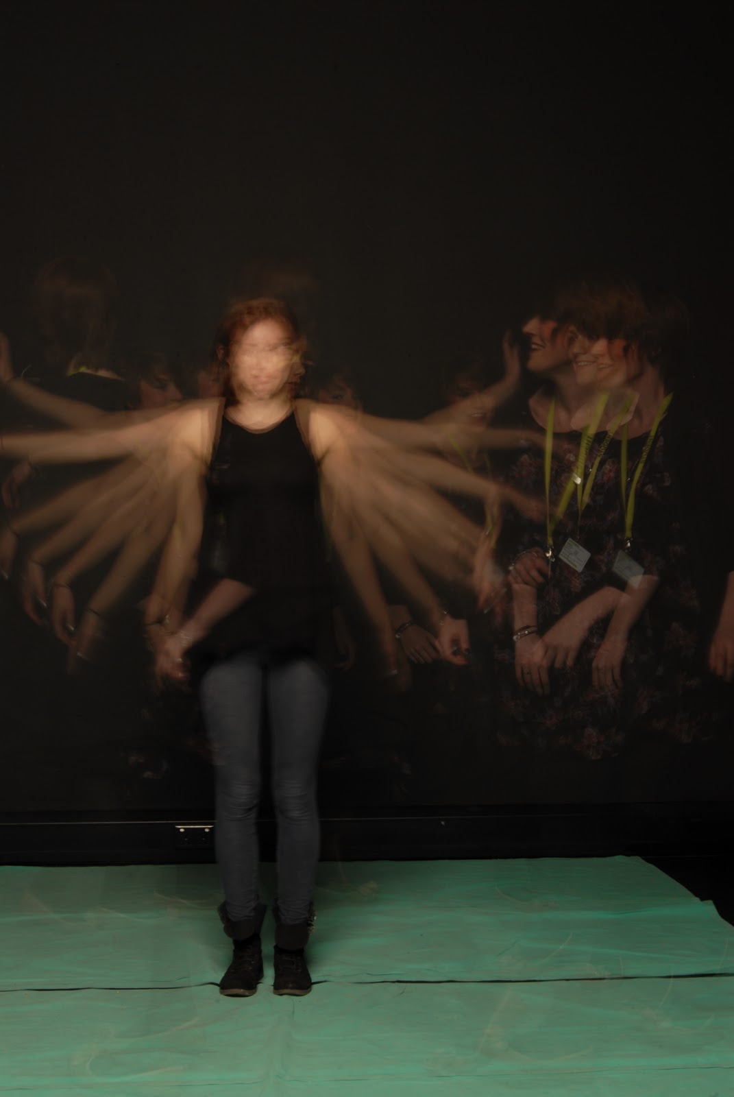
 To make this picture, I used a torch to draw Alex. I like the final image, because of the movement and continuous line, but it was a very strange thing to do, because you cant see what you have drawn until you look on the camera. I think it looks like there are two people in the picture.
We worked in pairs, one modelling and one drawing, then swapped over. I think all of the different styles of figure are very interesting, and when I put them all together it was very obvious that different torches had been used, to create the different coloured drawings.


We worked in pairs, one modelling and one drawing, then swapped over. I think all of the different styles of figure are very interesting, and when I put them all together it was very obvious that different torches had been used, to create the different coloured drawings.

Life drawing: Sculpture


Making the head sculpture was my favourite part, because of how much detail I could put in, but I also enjoyed the process of building up the head, starting with a newspaper base, then building up the basic head shape with clay. Each four minutes, we all moved positions, so as to get an all round view of the head. I struggled for a while to get the profile right, but I think my end result turned out well and is very realistic.

Wednesday, 17 October 2012
Photography Research.

Loretta Lux:
Lux is one of my favourite portrait photographers, because of the eerie expressions on the children's faces. Her portraits are very haunting and surreal. In this photo, 'Portrait of Antonia' I like the muted colours, because the neutral background makes the blue look very bright in comparison.
 Imogen Cunningham:
I like how abstract the shapes are in this photograph, although at the same time very realistic and detailed. The flowers really stand out from the black background, and the texture of the flowers is very subtle.

Sandy Skoglund:
Skoglund interested me because of how intricate her photo sets are, and how much work must have gone into the background to take just one photo. This one caught my eye because of the pattern that covers almost all of the people and items, but there are also parts that show through, like the suit, and parts left completely uncovered like the arms and legs of the women. The colours are not very varied, so you have to look closely to see all the details.
Photograms.
 We used the darkroom to create camera-less images on photographic paper. These photograms were made by putting objects onto the paper, which stopped the light from touching the paper. We used an enlarger to control how much light hit the paper, and this made an image of the object on the paper. These can be very simple, using solid objects such as a hand, to stop the light, or more complex using more than one object, and transparent objects to make very delicate patterns and shapes.
 for this one, I used a strip of lace, a doily and a glass bowl shaped like a leaf. I like the effect the glass has because some parts are white, and some are black.
I really liked the subtlety of the glass on the paper, so I decided to try with some other transparent objects. I really like how the crumpled plastic cup came out because of all the lines that go across the cup, as well as the lines that came from the creases. This photogram also has two ripped edges, and I think this gives it a very interesting outline.
 I wanted to use something more bold, but still delicate, so I stayed with transparent objects: a bottle, a ruler, a fork and some fabric with sequins on. The lettering on the ruler and sequins on the fabric were opaque, so were left white. I think the detail makes this photogram one of my favourites, as well as the parallel lines going across the paper.
The part I enjoyed most while making these photograms was experimenting with different objects and seeing how they came out when they were developed.
Sunday, 14 October 2012
Illustration: Observational bird drawings


This toucan is drawn using the same method, but with a felt tip pen. I like the shape of his beak and his feet. It looks like a toucan even though his head isn't complete.

Life drawing: Tone.


This week, we were using tone, with no lines. I found this very hard because it was difficult to put the blocks of tone in the right place and still get the proportions right. I also found it took more time to build the image, whereas with line it is easy to get the basic shapes in fairly quickly. I also found that the background plays a big part in the range of tones, as a dark background makes the figure look lighter and vice versa.At the start, we were just using charcoal on white cartridge paper, but I found it difficult to get the full range of tones, because a lot of shading was needed to make it dark enough that only the lightest highlights were still white.


After this, we used creamy beige coloured sugar paper, with white chalk and charcoal, so the background was quite light. I had to shade in the background to make it contrast with the figure.


Wednesday, 10 October 2012
Life Drawing: Perspective.
In our third week in life drawing, we focused on drawing figures from different perspectives and angles. The hardest part I found was not being able to measure in heads, when the whole of the head wasn't visible. we didnt do much work on tone this week, just proportions, angles and perspective.

 This one was very difficult. I measured it it feet instead of heads, and it was hard because my brain was telling me that a torso should be long, but because of the angle, this torso needed to be very short and angled, so I was trying to draw what I saw, and my brain was trying to draw what it thought a body should look like.


Life drawing: Line and Tone


In the lying down pose I think my hatching works better because of the very dark parts, like the shadow on her tummy and the back of her thigh.

Subscribe to:
Posts (Atom)