Sunday 30 September 2012

Ceramics


Next in applied arts was ceramics. we started by making small pots from red clay, my favourite method was the coil pot, because it was very easy to build up in the shape I wanted, and then could be smoothed out at the end, or left quite bumpy to make an interesting surface texture. We made other pots from grainy clay, using a dragging technique instead of rolling to lengthen the clay, so the texture stayed in the clay. I just used my hands to shape the clay into a conical pot.

  As well as making pots, we also rolled out slabs. Once my slab was flat and smooth, I painted it with white slip. I had to be very careful when I was painting onto the slab to only paint one way, so as not to mix the red clay into the slip. Once the slip was dry, I used a needle to carve a picture into the clay, so the red showed through where I had drawn.
 I chose to draw birds, and then added more detail in the background to make a whole scene.

  My favourite part of ceramics was having a go on the potters wheel. I found it easy to control the speed of the wheel, but it was difficult to keep my hands in the same place, and not move them with the clay. It was also difficult to keep the walls of the pot the same thickness all the way up, and not make thinner or thicker parts that might make the pot overbalance or deform as the wheel spins. Overall, I was very happy with my first attempt at throwing a pot.

Acid Etching

  One of my favourite processes we used was acid etching. I used an acid proof varnish to paint onto the tin plated steel, and waited for it to dry. Once it was dry, I painted another coat of varnish so it was thicker. When it was completely dry, I dropped my piece of metal into 30% nitric acid and waited for about three minutes.

  Once the visible metal had turned a dull grey colour, I took the metal out of the acid using tongs and put it in water. When I took it out of the water I had to dry it quickly so it wouldn't rust. I used methylated spirit to take the varnish off, which exposed the shiny metal that hadn't been exposed to the acid. There was a contrast between the shiny and the dull, but I wanted to create more difference between the background and the pattern.

   To make the background a different colour, I used a blow torch to heat the metal. As it heated up, the exposed steel changed colour, but the tin on top stayed the same. I had to be careful not to overheat the metal, or it would go too far past the colours and return to grey.

  The pattern of the tin stands out more on the coloured background, and the blowtorch creates interesting random patches because the heat is not constant over all the metal.

  On my cityscape, I held the heat on for too long, and as a result the background went past blue, to grey, so wasn't as dark as I wanted, but on my leopard print panel, I used the micro welder on a low setting, so I could control the heat better, and got the full range of colours, purple, dark blue, light blue, pink and straw coloured.


When you look very closely at the surface of the metal, the parts that have been corroded by the acid are not smooth, but have tiny dimples and a rough texture. I like this effect because it takes away all the properties people associate with metal, so it has the colour and texture of a different material.

Metalwork continued


After our first day in the metal workshop, I researched the artist Junko Mori, who works with metal, and uses many different processes to add effects and textures to her works. I tried to put these textures into my own work. I used a hammer to get a similar effect to Mori's 'silver organism' but I have used copper instead of silver. I like all the tiny marks the hammer makes that add up to make the overall surface of the metal.

I also wanted to use wire to make structures similar to Mori's. First I cut small strips of wire, and hammered both ends of the wire flat, as Mori did in some of her sculptures. I attached these pieces of wire to my block of wood using a piece of tin plated steel and nails. I bent the wire into a curved, more organic shape. I like the tapering effect of the wire because they look like petals.

I also used loops of wire to make petal shapes, and hammered the edges to flatten just the outside edges of the loops. I like this effect because it makes the curves more definite. I attached this to the edge of my wooden block using staples. I positioned it so it hung off the sides, so it could be seen from the other sides and different angles.

Wednesday 26 September 2012

Metalwork

In metalwork, we were testing out different processes to add textures and effects to sheet metal. First, I made a small wire flower and spot welded the centre. I then bent another piece of wire into a wave. I used these to press the pattern into a sheet of tin plated steel. I liked the impressions these made, and the metal stuck out on one side and was indented in on the other.


I then spot welded the wave onto the flower, and added leaves to create a whole flower. I liked this effect but I felt the wires were quite messy where they overlapped. I decided to put the flower through the metal roller to make it a more uniform width. I think this flower was very illustrative, and could be made into something such as a bookmark or a piece of jewellery. I did the same thing with a cat shape, and curved the tail around to make it more 3D.

   Next, I tried hammering a piece of wire, to flatten the end. This created a sort of tear-drop shape on the end of the wire. it also made the end shinier than the rest of the wire, as the hammer I used was very smooth and shiny and this transferred onto the wire.


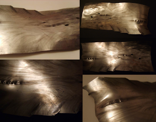
I then used a hammer with a round end on a scrap piece of tin plated steel to add a texture. I think this looks like fish scales as the marks are round and overlapped. I like the texture this gives because it makes it almost glittery because of the way the light reflects in lots of directions.


   Next I put a piece of tin plate steel through the metal roller. I had it on a very thin setting, and this made it pleat and fold. Before I rolled it out, I drilled some holes in it, and these were elongated by the roller. I also hammered one end of my strip, which made small marks like dashes on one end of my strip. I think this made the whole strip look like a river.

Saturday 22 September 2012

Fine Art


 This is the first piece I made, using a variety of methods to get my objects onto the paper. I used a projector to change the scale of my objects, like the pink scissors and the washer and bolt, and drew around them as well, to portray the same objects in different ways. I used poster paint, pencil crayon and pastel to get different textures and effects, but only used four colours, pink, purple, blue and green.
 I like this one because it is more direct, I used objects to apply the paint to the paper, such as a fork, a yoghurt pot, a piece of string, and then because my hands were covered in pink paint from the string, I made hand prints  instead of just drawing around them like I did  previously.


This one is one of my favourites, because I like the contrast between the very precise, almost photographic nature of the background with the random, messy blue on top. I found that dropping the paint-covered string, rather than laying it down, made better patterns and wiggles. I also like the simple blue and brown colour-scheme, because I think the brown makes the blue look bluer.
I like the contrast between the pink and green on this one, and the simplicity of the design. I added the blue right at the end, because without it, the colours felt too unbalanced because there was no mid tone in between the bright pink and the dark green.
I used rolled up paper and a projector to make the green spirals. I liked the green and brown together, and they looked very natural together, so I decided to add the blue as a contrast and focal point. I used the same method of dropping the string I used earlier, so the random patterns contrasted with the repetition of the background.


More paper models.


One of the reasons I chose my object in the first place was because I found it interesting that the middle part (the green bit) spins, so I decided to make a model to try to capture that. I wanted to show the roundness and movement, so I used scoring and folding to make a shape that I thought conveyed this. I started with  a quarter of a circle, and scored curved lines on both sides then folded it. to get it to spin, I wrapped the end around a metal pole, and threaded it through a slit in the other side so it was secure, but could still move around the pole. I made more of the same shape and put them in size order on the pole, with some going opposite ways.

I think the photo looks as if it is a snapshot taken when it was spinning because of the way the pieces curve. I also like how it looks very organic from the top.
  I made another to go with it, using the same method, but with semicircles instead of quarters. This meant there were no straight edges like on the first one. I liked how this captured the shape of the object better, but it didn't seem to me to have as much of a sense of movement as the first one. I think this might be because the pieces are thinner so they don't overlap as much.

   Once I had made these, I thought that they would make good lamps if a small light was placed under each of the paper petals, or they could be sculptures, put at either side of a doorway.

3D paper models

We used the same objects for our paper models that we used for our ink drawings. The aim was not to make a model of the object itself, but one inspired by it. One of my favourite parts of the object was the little screws on each end, so I decided to try to make a model which incorporated that spiral.  I decided the base of it would be a cylinder, and I wanted the screw thread to come out from the cylinder all the way round. To make it one continuous spiral, I drew diagonal lines on my paper, so that the end of one line was level horizontally with the start of the next. I then cut slits and folded the paper so the lines stuck out, Similar to making a paper lantern. When I curled the paper into a cylinder and secured it with masking tape, the spiral looked like one continuous line.
I then started thinking about fastening it without using anything other than the paper itself. I thought the best way to do this would be little tabs one one side and slits on the other. I folded the tabs back on themselves inside the cylinder so they wouldn't slip back through.

  I realise my explanation may not have made sense to everyone, so I have made a colour-coded diagram of where each diagonal line on my flat piece of paper goes when it is made into a cylinder.


The end of the red line meets the start of the yellow line, the end of the yellow line meets the start of the green line, etc. Hope that makes sense!

Thursday 20 September 2012

Indian Ink

 The first drawings are done in graphite stick, to try to be freer and more sketchy. We then moved on to indian ink, using strips of card to draw with, so smaller details were done with the very edge of the card, and shading and larger parts with the flat part. I was quite pleased with my shading by the end. I like the semi-transparent nature of the ink because you can go over it to get darker tones and shadows but it also fades into light so there's a good range of tones from just one type of ink.

Monday 17 September 2012

Line Drawing

This is my line drawing of a coffee percolator which I did in pencil, without using shading. I found it hard to get the lines straight and make it look 3D. I  also struggled getting the top and the bottom curves equal. I then chose to use a 9B graphite stick to get a more definite line. I drew the ellipses first, to get them lined up, and then drew my next line drawing. I found that this was more successful because the proportions were right and because the lines were darker I think it communicated the shape and form better.

   We also tried drawing objects with as few marks as possible (each time the pencil lifted off the paper counted as a mark). I drew a phone using nine marks. I found this very interesting because it made me really think about which lines were important, and what could be left out without affecting the communication of the object to the viewer. I quite enjoyed the challenge of drawing in such a stripped-back and basic style.

Bauhaus

 In our week in 3D design, we looked at iconic products and designers. While I was researching Bauhaus, I found a teapot designed by Marianne Brandt. What I like about this piece is that although it was designed in 1927, it looks as if it could have been designed this year because  the simple lines and shapes make it very modern and contemporary.
   Bauhaus products are designed to be functional as well as decorative, and I think this teapot fulfills that purpose very well. It has a heat resistant handle and a built in tea strainer, so functions well, and is also very sculptural in its form.

   I also love the simplicity of this Bauhaus book cradle, it performs its function in that it holds books, but the primary colours and simple shapes make it a beautiful piece of design.

Bauhaus design seems to me to be timeless.


Saturday 15 September 2012

Hello!

Hello, my name is Mabel and this is my new Art & Design blog. Enjoy!